From traditional
banking to fintech
PEX was looking to break deeper into the Fintech industry by modernizing their web appearance. They felt their existing website needed an upgrade to compete with other new entrants to the Fintech marketplace.
Deliverable:
PEX
Deliverable:
Website
Role:
Product designer
Tools:
Figma
Industry:
Fintech, banking

T H E N E E D
Website before redesign
T H E C H A L L E N G E


M A R K E T R E S E A R C H
Competitor analysis

U S E R R E S E A R C H
Initial user interviews
PEX had no project bandwidth for user interviews and opted to work directly with me to provide close feedback on their end-user needs. I combined this with competitor research to identify the following key needs and priorities:
💵️
User want to feel that signing up for a service like PEX will remove an item from their to-do list. They are also very price sensitive.
🔑
Industry-Specific
User want a solution they feel captures the idiosyncrasies of money management in their specific industry such as setting limits or industry-specific benefits.
📲
Cross Platform
Users want optimized flow between web and mobile options in order to bring important financial data with them everywhere. Users are looking for a hands-off option.
🥕
Incentives for Card Holders
Offering exciting and unique advantages while performing daily tasks, as well as showcasing those programs, is a big-value add in this financial space.
T H E C H A L L E N G E
Role and impact
Below are 3 rounds of website designs. To arrive at these solutions, I did the following:
1.
I conducted incisive competitor research and presented the conclusions to PEX stakeholders for their impressions and goals for the rebrand.
2.
I surveyed existing design methodologies in the Fintech sphere and personalized those designs to fit PEX’s market.
3.
I maintained a close partnership with PEX stakeholder’s throughout the design process to prioritize their personal design philosophy for their brand.
T H E C H A L L E N G E
Inspiration
PEX was looking for a fintech feel and hoping to update their branding to include modern colors and typography. I looked at some other websites and was inspired by the full-width imagery, large text, and gradients. Striking a balance between clean/minimalist but with moments of bold personality was the key.

T H E C H A L L E N G E
First Pass


T H E C H A L L E N G E
Second Pass


T H E C H A L L E N G E
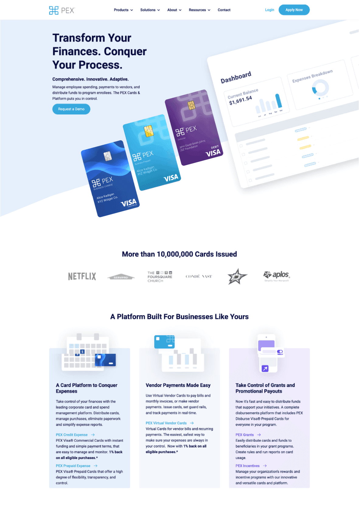
Final Pass


T H E C H A L L E N G E

